In this article we are going to explore how both parts of Hotwire (Turbo and Stimulus) can work together in a beautiful collaboration to build a lightbox with a delightful developer experience.
This particular example lays out some of the key aspects and techniques when working with the new Rails frontend stack. We will use Turbo to lazy load images into the lightbox’s modal, and Stimulus to
- wrap a third party JavaScript library (Swiper.js),
- swap out Turbo Frame content using targets,
- defining dynamic properties in the markup and pass using the new action parameters, and
- loosely communicate between controllers using events to exchange metadata.
I’m building this on top of Sean P. Doyle’s excellent hotwire examples template again, which makes it easy to compare approaches 🙇.
Let’s get to it! First, let’s add a resource that has some images attached via ActiveStorage:
$ bin/rails g scaffold Article title:string images:attachments
We define variant called thumb directly in the has_many_attached declaration.
# app/models/article.rb

class Article < ApplicationRecord
  has_many_attached :images do |attachable|
    attachable.variant :thumb, resize_to_limit: [640, 480]
  end
end
After adding four article fixtures, we call
$ bin/setup
which sets up the database and seeds it. Then, we create a test/fixtures/files directory and put some sample images there. In a Rails console, we just attach 2 images to each article.
Article.find_each.with_index do |article, article_index|
  (1..2).each do |file_index|
    index = article_index * 2 + file_index
    article.images.attach(io: File.open(Rails.root.join("test/fixtures/files/#{index}.jpeg")), filename: "#{index}.jpeg")
  end
end
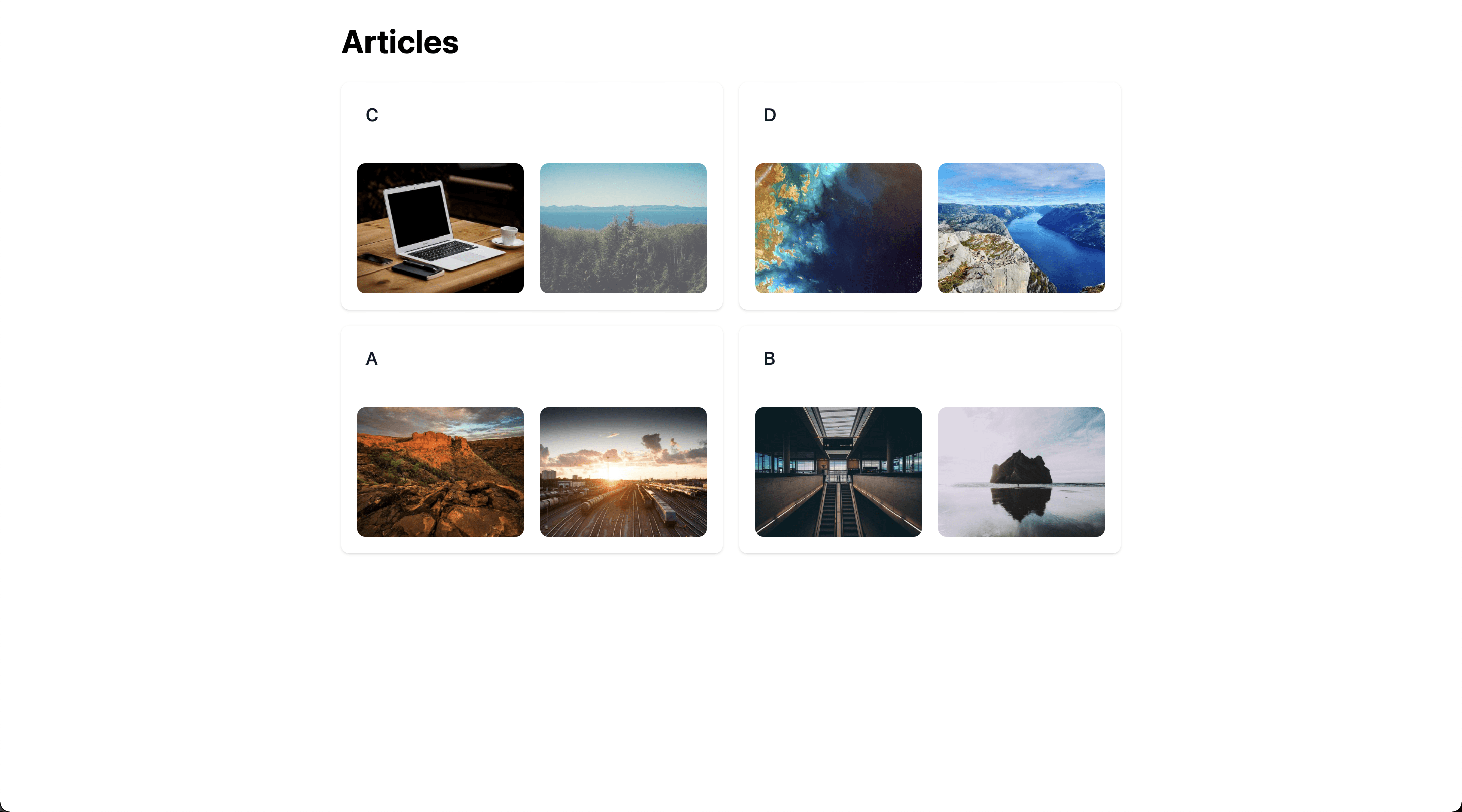
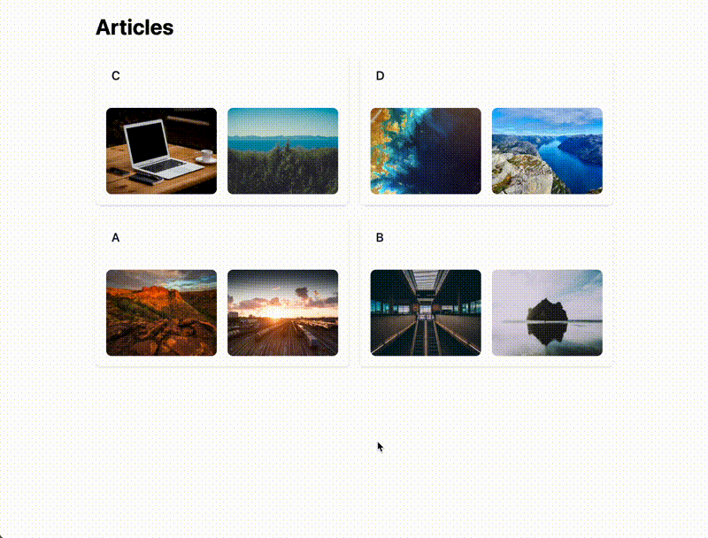
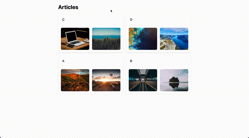
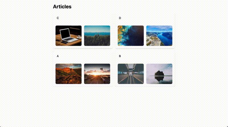
We display articles in a grid together with image thumbnails:
<!-- app/views/articles/index.html.erb -->
<h1>Articles</h1>

<div id="articles" class="grid grid-cols-2 gap-4">
  <% @articles.each do |article| %>
    <%= render article %>
  <% end %>
</div>

<!-- app/views/articles/_article.html.erb -->
<div class="bg-white overflow-hidden shadow rounded-lg" id="<%= dom_id article %>">
  <div class="bg-white px-4 py-5 border-b border-gray-200 sm:px-6">
    <h3 class="text-lg leading-6 font-medium text-gray-900 m-0"><%= article.title %></h3>
  </div>

  <ul class="list-none grid grid-cols-2 gap-x-4 gap-y-8 px-4">
    <% article.images.each do |image| %>
      <li class="relative">
        <div class="group block w-full h-32 rounded-lg bg-gray-100 focus-within:ring-2 focus-within:ring-offset-2 focus-within:ring-offset-gray-100 focus-within:ring-indigo-500 overflow-hidden">
          <%= image_tag image.variant(:thumb), class: "object-cover h-full w-full group-hover:opacity-75" %>
        </div>
      </li>
    <% end %>
  </ul>
</div>
This is what it looks like:
Build the Modal
In the next step, we are going to implement the modal markup and logic. The HTML boilerplate can be found below, it’s essentially composed of a modal backdrop with a close button and a content area:
<!-- app/views/attachments/_modal.html.erb -->
<div class="hidden fixed z-30 inset-0 overflow-y-auto" data-lightbox-target="modal">
<div class="flex items-center justify-center h-screen pt-4 px-4 pb-20 text-center sm:block sm:p-0">
<%# Background %>
<div class="opacity-0 fixed inset-0 transition-opacity" data-lightbox-target="background">
<div class="absolute inset-0 bg-gray-700 bg-opacity-75">
<%# top left slide labels %>
<div class="sm:block absolute top-0 left-0 pt-4 pl-4">
<span class="text-white font-medium"><!-- will hold the slide name --></span>
</div>
<%# X-close icon in top-right corner %>
<div class="sm:block absolute top-0 right-0 pt-4 pr-4">
<%= link_to "#", class: "text-gray-100" do %>
<svg class="w-6 h-6" fill="none" stroke="currentColor" viewBox="0 0 24 24" xmlns="http://www.w3.org/2000/svg"><path stroke-linecap="round" stroke-linejoin="round" stroke-width="2" d="M6 18L18 6M6 6l12 12"></path></svg>
<% end %>
</div>
</div>
</div>
<%# Trick the browser into centering modal contents %>
<span class="hidden sm:inline-block sm:align-middle sm:h-screen" aria-hidden="true">​</span>
<div class="relative inline-block align-bottom rounded-lg text-left overflow-hidden transition-all sm:my-8 sm:align-middle sm:w-3/4 inset-0">
<!-- content will go here -->
</div>
</div>
</div>
In our articles index view, we render it:
  <!-- app/views/artices/index.html.erb -->
  <h1>Articles</h1>

+ <%= render "attachments/modal" %>

  <div id="articles" class="grid grid-cols-2 gap-4">
    <% @articles.each do |article| %>
      <%= render article %>
    <% end %>
  </div>
Now, before we go any further, let’s make sure that the most basic modal functionality - opening and closing - works. For this we create a lightbox_controller in our Stimulus controllers’ home directory. It attaches to the modal and background targets you can find in the markup above, and defines a handleOpen and handleClose action, both essentially toggling CSS classes to control the modal’s visibility:
// app/javascript/controllers/lightbox_controller.js
import { Controller } from "stimulus";

export default class extends Controller {
  static targets = ["modal", "background"];

  handleOpen(event) {
    event.preventDefault();
    this.modalTarget.classList.remove("hidden");
    this.backgroundTarget.classList.remove("opacity-0");
    this.backgroundTarget.classList.add("opacity-100");
  }

  handleClose(event) {
    event.preventDefault();
    this.modalTarget.classList.add("hidden");
    this.backgroundTarget.classList.remove("opacity-100");
    this.backgroundTarget.classList.add("opacity-0");
  }
}
This gets attached to the <body> element in our application layout, so that any view can define a lightbox:
<!-- app/views/layouts/application.html.erb -->
<!DOCTYPE html>
<html>
  <head>
    <title>HotwireExampleTemplate</title>
    <meta name="viewport" content="width=device-width,initial-scale=1">
    <%= csrf_meta_tags %>
    <%= csp_meta_tag %>

    <script src="https://cdn.tailwindcss.com"></script>
    <%= stylesheet_link_tag "application", "data-turbo-track": "reload" %>
    <%= javascript_importmap_tags %>
  </head>

- <body class="font-sans">
+ <body class="font-sans" data-controller="lightbox">
    <div class="max-w-7xl mx-auto px-4 sm:px-6 lg:px-8 font">
      <div class="max-w-3xl mx-auto">
        <%= yield %>
      </div>
    </div>
  </body>
</html>
To open the modal, we call the handleOpen action when clicking on an image:
  <!-- app/views/articles/_article.html.erb -->
  <div class="bg-white overflow-hidden shadow rounded-lg" id="<%= dom_id article %>">
    <div class="bg-white px-4 py-5 border-b border-gray-200 sm:px-6">
      <h3 class="text-lg leading-6 font-medium text-gray-900 m-0"><%= article.title %></h3>
    </div>

    <ul class="list-none grid grid-cols-2 gap-x-4 gap-y-8 px-4">
      <% article.images.each do |image| %>
        <li class="relative">
          <div class="group block w-full h-32 rounded-lg bg-gray-100 focus-within:ring-2 focus-within:ring-offset-2 focus-within:ring-offset-gray-100 focus-within:ring-indigo-500 overflow-hidden">
-           <%= image_tag image, class: "object-cover h-full w-full group-hover:opacity-75" %>
+           <%= image_tag image, class: "object-cover h-full w-full group-hover:opacity-75", data: {action: "click->lightbox#handleOpen"} %>
          </div>
        </li>
        <% end %>
    </ul>
  </div>
And close it by clicking on the close button in the top right corner:
<!-- app/views/attachments/_modal.html.erb -->
<div class="hidden fixed z-30 inset-0 overflow-y-auto" data-lightbox-target="modal">
<div class="flex items-center justify-center h-screen pt-4 px-4 pb-20 text-center sm:block sm:p-0">
<%# Background %>
<div class="opacity-0 fixed inset-0 transition-opacity" data-lightbox-target="background">
<div class="absolute inset-0 bg-gray-700 bg-opacity-75">
<%# top left slide labels %>
<div class="sm:block absolute top-0 left-0 pt-4 pl-4">
<span class="text-white font-medium"><!-- will hold the slide name --></span>
</div>
<%# X-close icon in top-right corner %>
<div class="sm:block absolute top-0 right-0 pt-4 pr-4">
- <%= link_to "#", class: "text-gray-100" do %>
+ <%= link_to "#", class: "text-gray-100", data: {action: "click->lightbox#handleClose"} do %>
<svg class="w-6 h-6" fill="none" stroke="currentColor" viewBox="0 0 24 24" xmlns="http://www.w3.org/2000/svg"><path stroke-linecap="round" stroke-linejoin="round" stroke-width="2" d="M6 18L18 6M6 6l12 12"></path></svg>
<% end %>
</div>
</div>
</div>
<%# Trick the browser into centering modal contents %>
<span class="hidden sm:inline-block sm:align-middle sm:h-screen" aria-hidden="true">​</span>
<div class="inline-block align-bottom rounded-lg text-left overflow-hidden transition-all sm:my-8 sm:align-middle sm:w-3/4 inset-0">
<!-- content will go here -->
</div>
</div>
</div>
Loading Lightbox Contents via Turbo Frame
Next up we will explore how we can use a lazily loaded Turbo Frame to display the images in our lightbox. Let’s start out by generating an AttachmentsController and defining a route for it:
$ bin/rails g controller Attachments index
  # config/routes.rb

  Rails.application.routes.draw do
    resources :articles do
+     resources :attachments, only: :index
    end
  end
Since images are attached to an article, we query it from the controller params. Notice that we set layout false for performance reasons - when rendering a single Turbo Frame to be swapped out in the frontend, there’s no need to render the whole <head> etc.
# app/controllers/attachments_controller.rb

class AttachmentsController < ApplicationController
  layout false

  before_action :set_article, only: :index

  def index
  end

  private

  def set_article
    @article = Article.find(params[:article_id])
  end
end
We render out a <turbo_frame>, and to test it out preliminarily just display a bunch of <img> tags:
<!-- app/views/attachments/index.html.erb -->

<%= turbo_frame_tag :attachment_gallery do %>
  <% record.images.each do |image| %>
    <%= image_tag image, class: "object-contain rounded-xl px-6 h-full mx-auto max-h-screen" %>
  <% end %>
<% end %>
Now, in the modal we add an empty turbo frame tag in the content area, and define a new target (frame) for our Stimulus lightbox_controller:
<!-- app/views/attachments/_modal.html.erb -->
<div class="hidden fixed z-30 inset-0 overflow-y-auto" data-lightbox-target="modal">
<div class="flex items-center justify-center h-screen pt-4 px-4 pb-20 text-center sm:block sm:p-0">
<%# Background %>
<div class="opacity-0 fixed inset-0 transition-opacity" data-lightbox-target="background">
<div class="absolute inset-0 bg-gray-700 bg-opacity-75">
<%# top left slide labels %>
<div class="sm:block absolute top-0 left-0 pt-4 pl-4">
<span class="text-white font-medium"><!-- will hold the slide name --></span>
</div>
<%# X-close icon in top-right corner %>
<div class="sm:block absolute top-0 right-0 pt-4 pr-4">
<%= link_to "#", class: "text-gray-100", data: {action: "click->lightbox#handleClose"} do %>
<svg class="w-6 h-6" fill="none" stroke="currentColor" viewBox="0 0 24 24" xmlns="http://www.w3.org/2000/svg"><path stroke-linecap="round" stroke-linejoin="round" stroke-width="2" d="M6 18L18 6M6 6l12 12"></path></svg>
<% end %>
</div>
</div>
</div>
<%# Trick the browser into centering modal contents %>
<span class="hidden sm:inline-block sm:align-middle sm:h-screen" aria-hidden="true">​</span>
<div class="inline-block align-bottom rounded-lg text-left overflow-hidden transition-all sm:my-8 sm:align-middle sm:w-3/4 inset-0">
- <!-- content will go here -->
+ <%= turbo_frame_tag :attachment_gallery, src: "", data: { "lightbox-target": "frame"} %>
</div>
</div>
</div>
We can now add an action parameter to our image tag, defining the URL to load into that turbo frame. Remember that data-lightbox-url-param can be parsed out by your Stimulus action when it’s invoked, as we shall see below.
  <!-- app/views/articles/_article.html.erb -->
  <div class="bg-white overflow-hidden shadow rounded-lg" id="<%= dom_id article %>">
    <div class="bg-white px-4 py-5 border-b border-gray-200 sm:px-6">
      <h3 class="text-lg leading-6 font-medium text-gray-900 m-0"><%= article.title %></h3>
    </div>

    <ul class="list-none grid grid-cols-2 gap-x-4 gap-y-8 px-4">
      <% article.images.each do |image| %>
        <li class="relative">
          <div class="group block w-full h-32 rounded-lg bg-gray-100 focus-within:ring-2 focus-within:ring-offset-2 focus-within:ring-offset-gray-100 focus-within:ring-indigo-500 overflow-hidden">
-           <%= image_tag image, class: "object-cover h-full w-full group-hover:opacity-75", data: {action: "click->lightbox#handleOpen"} %>
+           <%= image_tag image.variant(:thumb),
+            class: "object-cover h-full w-full group-hover:opacity-75",
+            data: {
+              action: "click->lightbox#handleOpen",
+              lightbox_url_param: article_attachments_path(article)
+            } %>
          </div>
        </li>
      <% end %>
    </ul>
  </div>
To glue it all together, we need to add said frame to our lightbox_controller, and retrieve the URL from event.params when the handleOpen action is invoked. All that’s left to do is swap out the Turbo Frame’s src, and its lazy loading mechanism will do the rest.
  // app/javascript/controllers/lightbox_controller.js
  import { Controller } from "stimulus";

  export default class extends Controller {
-   static targets = ["modal", "background"];
+   static targets = ["modal", "background", "frame"];

    handleOpen(event) {
      event.preventDefault();
      this.modalTarget.classList.remove("hidden");
      this.backgroundTarget.classList.remove("opacity-0");
      this.backgroundTarget.classList.add("opacity-100");

+     const { url } = event.params;
+     this.frameTarget.src = url;
    }

    handleClose(event) {
      event.preventDefault();
      this.modalTarget.classList.add("hidden");
      this.backgroundTarget.classList.remove("opacity-100");
      this.backgroundTarget.classList.add("opacity-0");
    }
  }
Here’s a GIF of the intermediary results, showing how Turbo Frame contents are different with respect to the article you select.

Note: With a little effort, this could be made more polymorphic (i.e., not tied to an Article, but all kinds of attachables) - this is left as an exercise to the reader :-)
Integrating Swiper.js
Now, to transform this list of images into a lightbox, we’re going to make use of swiper.js. So let’s pin that to our importmap:
$ bin/importmap pin swiper
For demonstration purposes, let’s also add the swiper CSS from a CDN:
<!-- app/views/layouts/application.html.erb -->
<!DOCTYPE html>
<html>
  <head>
    <title>HotwireExampleTemplate</title>
    <meta name="viewport" content="width=device-width,initial-scale=1">
    <%= csrf_meta_tags %>
    <%= csp_meta_tag %>

+   <link
+     rel="stylesheet"
+     href="https://unpkg.com/swiper@8/swiper-bundle.min.css"
+   />
    <script src="https://cdn.tailwindcss.com"></script>
    <%= stylesheet_link_tag "application", "data-turbo-track": "reload" %>
    <%= javascript_importmap_tags %>
  </head>

  <body class="font-sans" data-controller="lightbox">
    <div class="max-w-7xl mx-auto px-4 sm:px-6 lg:px-8 font">
      <div class="max-w-3xl mx-auto">
        <%= yield %>
      </div>
    </div>
  </body>
</html>
Swiper offloads some of its functionality into modules, such as Navigation, which we activate in our application entrypoint:
  // app/javascript/application.js

  // Configure your import map in config/importmap.rb. Read more: https://github.com/rails/importmap-rails
  import "tailwind.config";
  import "@hotwired/turbo-rails";
  import "controllers";
  import "trix";
  import "@rails/actiontext";
+ import Swiper, { Navigation } from "swiper";

+ Swiper.use([Navigation]);
The Stimulus controller wrapping swiper is rather simplistic. All it does, is initialize swiper on a container target, which we configure to take the next and prev targets as navigation links.
// app/javascript/controllers/swiper_controller.js
import Swiper from "swiper";
import { Controller } from "@hotwired/stimulus";

export default class extends Controller {
  static targets = ["container", "next", "prev"];

  connect() {
    this.swiper = new Swiper(this.containerTarget, {
      navigation: {
        nextEl: this.nextTarget,
        prevEl: this.prevTarget,
      },
    });
  }
}
Now all that’s left for us to do is to restructure our gallery markup a bit, so that it conforms to the swiper HTML layout. That more or less means that we need to wrap everything in a div with a swiper-wrapper class, and each slide in a div with a swiper-slide class. Additionally, we add the markup for the navigation buttons:
<!-- app/views/attachments/index.html.erb -->

  <%= turbo_frame_tag :attachment_gallery do %>
-   <% @article.images.each do |image| %>
-     <%= image_tag image, class: "object-contain rounded-xl px-6 h-full mx-auto max-h-screen" %>
-   <% end %>
+   <div data-controller="swiper">
+     <div class="swiper" data-swiper-target="container">
+       <div class="swiper-wrapper">
+         <% @article.images.each do |image| %>
+           <div class="swiper-slide flex justify-center"
+             <%= image_tag image, class: "object-contain rounded-xl h-96 mx-auto" %>
+           </div>
+         <% end %>
+       </div>
+
+       <div class="swiper-button-prev" data-swiper-target="prev">
+       </div>
+       <div class="swiper-button-next" data-swiper-target="next">
+       </div>
+     </div>
+   </div>
  <% end %>
And that’s all there is to it really. Behold:
Start at the Correct Slide
There is one tiny detail that’s detrimental to an immaculate lightbox experience. As it stands, regardless which image you click on, the modal will always show the first slide:

What can we do about it? This is where some clever cross (Stimulus) controller communication can save the day. Swiper has a way to slideTo a certain slide, so all we need to do is
- when opening the modal, find a way to refer to it (a key)
- pass that key off to the
swiper_controller - invoke
swiper.slideTo
Each ActiveStorage blob has a key that we can attach to our thumbnails as another Stimulus action parameter:
  <!-- app/views/articles/_article.html.erb -->
  <div class="bg-white overflow-hidden shadow rounded-lg" id="<%= dom_id article %>">
    <div class="bg-white px-4 py-5 border-b border-gray-200 sm:px-6">
      <h3 class="text-lg leading-6 font-medium text-gray-900 m-0"><%= article.title %></h3>
    </div>

    <ul class="list-none grid grid-cols-2 gap-x-4 gap-y-8 px-4">
      <% article.images.each do |image| %>
        <li class="relative">
          <div class="group block w-full h-32 rounded-lg bg-gray-100 focus-within:ring-2 focus-within:ring-offset-2 focus-within:ring-offset-gray-100 focus-within:ring-indigo-500 overflow-hidden">
            <%= image_tag image.variant(:thumb),
             class: "object-cover h-full w-full group-hover:opacity-75",
             data: {
               action: "click->lightbox#handleOpen",
               lightbox_url_param: article_attachments_path(article),
+              lightbox_key_param: image.key
             } %>
          </div>
        </li>
      <% end %>
    </ul>
  </div>
We can grab that key off event.params just as we did with the URL before. Now all we need to do is to await the loaded promise on a Turbo Frame element, which resolves once the frame’s current navigation (the loading of the image slides) has completed. Then we dispatch an “open” event, appending the key to the event’s detail object:
  // app/javascript/controllers/lightbox_controller.js
  import { Controller } from "stimulus";

  export default class extends Controller {
    static targets = ["modal", "background", "frame"];

-   handleOpen(event) {
+   async handleOpen(event) {
      event.preventDefault();
      this.modalTarget.classList.remove("hidden");
      this.backgroundTarget.classList.remove("opacity-0");
      this.backgroundTarget.classList.add("opacity-100");

-     const { url } = event.params;
+     const { url, key } = event.params;
      this.frameTarget.src = url;

+     await this.frameTarget.loaded;
+
+     this.dispatch("open", { detail: { key } });
    }

    handleClose(event) {
      event.preventDefault();
      this.modalTarget.classList.add("hidden");
      this.backgroundTarget.classList.remove("opacity-100");
      this.backgroundTarget.classList.add("opacity-0");
    }
  }
In the gallery view, we listen for that event and call a (new) swiper#naviate action. We also add the blob key to each slide to be able to select it later:
<!-- app/views/attachments/index.html.erb -->

  <%= turbo_frame_tag :attachment_gallery do %>
-   <div data-controller="swiper">
+   <div data-controller="swiper"
+     data-action="lightbox:open@document->swiper#navigate">
      <div class="swiper" data-swiper-target="container">
        <div class="swiper-wrapper">
          <% @article.images.each do |image| %>
            <div class="swiper-slide flex justify-center"
+                data-key="<%= image.key %>"
              <%= image_tag image, class: "object-contain rounded-xl h-96 mx-auto" %>
            </div>
          <% end %>
        </div>

        <div class="swiper-button-prev" data-swiper-target="prev">
        </div>
        <div class="swiper-button-next" data-swiper-target="next">
        </div>
      </div>
    </div>
  <% end %>
The swiper_controller is equipped with said action, navigate. For good measure we add an activeKey target that we set to the key passed by the event. In an after-change callback (activeKeyValueChanged), we find the correct index in our slides corresponding to the active key using the data attribute we defined above. Then we invoke slideTo with an animation time of 0, setting it instantly. This usage of a Stimulus value provides a neat extension point should we want to set the active key from outside.
  // app/javascript/controllers/swiper_controller.js
  import Swiper from "swiper";
  import { Controller } from "@hotwired/stimulus";

  export default class extends Controller {
    static targets = ["container", "next", "prev"];
+   static values = { activeKey: String };

    connect() {
      this.swiper = new Swiper(this.containerTarget, {
        navigation: {
          nextEl: this.nextTarget,
          prevEl: this.prevTarget,
        },
      });
    }
+
+   navigate(event) {
+     event.preventDefault();
+
+     const { key } = event.detail;
+
+     this.activeKeyValue = key;
+   }
+
+   activeKeyValueChanged() {
+     const activeSlide = this.swiper?.slides.findIndex(
+       (slide) => slide.dataset.key == this.activeKeyValue
+     );
+
+     this.swiper?.slideTo(activeSlide, 0);
+   }
  }
Now everything works as advertised:
Bonus: Setting the Slide Name
There’s a final nice tidbit I want to share with you. Using the same mechanism from above, we will send an event the other way round, from the swiper_controller to the lightbox_controller, to display the active slide’s filename in the modal header. To achieve this, we add the filename to the slide’s dataset, just like we did with the blob key before:
  <!-- app/views/attachments/index.html.erb -->

  <%= turbo_frame_tag :attachment_gallery do %>
    <div data-controller="swiper"
      data-action="lightbox:open@document->swiper#navigate">
      <div class="swiper" data-swiper-target="container">
        <div class="swiper-wrapper">
          <% @article.images.each do |image| %>
            <div class="swiper-slide flex justify-center"
                 data-key="<%= image.key %>"
+                data-filename="<%= image.blob.filename %>">
              <%= image_tag image, class: "object-contain rounded-xl h-96 mx-auto" %>
            </div>
          <% end %>
        </div>

        <div class="swiper-button-prev" data-swiper-target="prev">
        </div>
        <div class="swiper-button-next" data-swiper-target="next">
        </div>
      </div>
    </div>
  <% end %>
Swiper exposes a few callbacks, such as slideChange, which we use to dispatch a slide-change event including the active slide’s name from the dataset.
  // app/javascript/controllers/swiper_controller.js
  import Swiper from "swiper";
  import { Controller } from "@hotwired/stimulus";

  export default class extends Controller {
    static targets = ["container", "next", "prev"];
    static values = { activeKey: String };

    connect() {
      this.swiper = new Swiper(this.containerTarget, {
        navigation: {
          nextEl: this.nextTarget,
          prevEl: this.prevTarget,
        },
+       on: {
+         slideChange: this.handleSlideChange.bind(this),
+       },
      });
    }

    navigate(event) {
      event.preventDefault();

      const { key } = event.detail;

      this.activeKeyValue = key;
    }

    activeKeyValueChanged() {
      const activeSlide = this.swiper?.slides.findIndex(
        (slide) => slide.dataset.key == this.activeKeyValue
      );

      this.swiper?.slideTo(activeSlide, 0);
    }

+   handleSlideChange(swiper) {
+     this.dispatch("slide-change", {
+       detail: { slideName: swiper.slides[swiper.activeIndex].dataset.filename },
+     });
+   }
  }
In the lightbox_controller, we add a new slideName target, which we populate from that event in a new action, setSlideName.
  // app/javascript/controllers/lightbox_controller.js
  import { Controller } from "stimulus";

  export default class extends Controller {
-   static targets = ["modal", "background", "frame"];
+   static targets = ["modal", "background", "frame", "slideName"];

    async handleOpen(event) {
      event.preventDefault();
      this.modalTarget.classList.remove("hidden");
      this.backgroundTarget.classList.remove("opacity-0");
      this.backgroundTarget.classList.add("opacity-100");

      const { url, key } = event.params;
      this.frameTarget.src = url;

      await this.frameTarget.loaded;

      this.dispatch("open", { detail: { key } });
    }

    handleClose(event) {
      event.preventDefault();
      this.modalTarget.classList.add("hidden");
      this.backgroundTarget.classList.remove("opacity-100");
      this.backgroundTarget.classList.add("opacity-0");
    }

+   setSlideName({ detail }) {
+     this.slideNameTarget.textContent = detail.slideName;
+   }
  }
The final missing piece is to declare this event listener in the markup, and define the slideName target:
<!-- app/views/attachments/_modal.html.erb -->
- <div class="hidden fixed z-30 inset-0 overflow-y-auto" data-lightbox-target="modal">
+ <div class="hidden fixed z-30 inset-0 overflow-y-auto" data-lightbox-target="modal" data-action="swiper:slide-change->lightbox#setSlideName">
<div class="flex items-center justify-center h-screen pt-4 px-4 pb-20 text-center sm:block sm:p-0">
<%# Background %>
<div class="opacity-0 fixed inset-0 transition-opacity" data-lightbox-target="background">
<div class="absolute inset-0 bg-gray-700 bg-opacity-75">
<%# top left slide labels %>
<div class="sm:block absolute top-0 left-0 pt-4 pl-4">
- <span class="text-white font-medium"><!-- will hold the slide name --></span>
+ <span class="text-white font-medium" data-lightbox-target="slideName"></span>
</div>
<%# X-close icon in top-right corner %>
<div class="sm:block absolute top-0 right-0 pt-4 pr-4">
<%= link_to "#", class: "text-gray-100", data: {action: "click->lightbox#handleClose"} do %>
<svg class="w-6 h-6" fill="none" stroke="currentColor" viewBox="0 0 24 24" xmlns="http://www.w3.org/2000/svg"><path stroke-linecap="round" stroke-linejoin="round" stroke-width="2" d="M6 18L18 6M6 6l12 12"></path></svg>
<% end %>
</div>
</div>
</div>
<%# Trick the browser into centering modal contents %>
<span class="hidden sm:inline-block sm:align-middle sm:h-screen" aria-hidden="true">​</span>
<div class="inline-block align-bottom rounded-lg text-left overflow-hidden transition-all sm:my-8 sm:align-middle sm:w-3/4 inset-0">
<%= turbo_frame_tag :attachment_gallery, src: "", data: { "lightbox-target": "frame"} %>
</div>
</div>
</div>
Tada, here’s our modal displaying the filename in the header! 🎉

